Rafa.
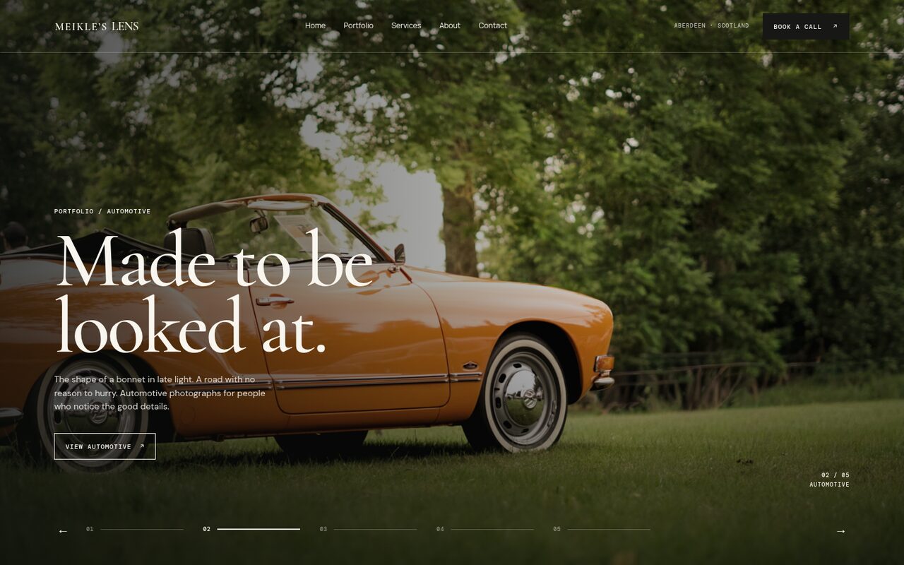
Rafa is a photographer in Aberdeen. I built his website and branding, with a gallery system and an admin panel so he can run the whole site himself, and adapted the design to his logo.
What is in the site.
Five parts, built so a photographer can run his own site. Scroll to follow along.
-
Brand · Look and feel
Design adapted to his logo
Website and branding for a photographer in Aberdeen, with the design adapted to his logo and his feel.
1BrandLook and feel -
Gallery · His work
A gallery system
A gallery system built for a photographer’s work.
2GalleryHis work -
Admin · Control
An admin panel he runs himself
An admin panel with full control of the site, so he can run the whole site himself without my intervention.
3AdminControl -
Booking · Calendar
A booking calendar for first calls
A three-step calendar (a day, a time, confirmed) holds the slot on Google Calendar and sends the invite. Rafa sets his own hours in the admin.
4BookingCalendar -
Live · Online
Live on its own address
The site is live at meikleslens.merwe.dev.
5LiveOnline
The design system.
Colour, type, principles and the decisions behind the site, from the design document.
Paper, ink and one sage accent.
A cinematic portfolio and booking site where the photographs lead and the interface stays quiet. The palette is drawn from the things the work is about: paper, ink, and the muted green of Scottish stone and moss.
Sage is the only accent: the preloader’s percent sign, the booking calendar’s selected state and small highlights. Select a swatch to copy its value.
The image is the authority
Photos are never cropped to fit a layout. Galleries keep each image’s native aspect ratio, and hero and portfolio images are served as the original files.
Quiet interface, confident type
Warm paper tones, a single sage accent, hairline rules and small monospaced labels. A large serif carries the voice, so the chrome around the photographs can stay out of the way.
Motion that can be switched off
Movement is slow and purposeful, and every decorative animation respects reduced-motion settings. Pause, drag and keyboard control are kept wherever something moves.
The owner is the editor
Anything a photographer would change monthly lives in the admin panel, not in code: work, order, categories, videos and availability.
The homepage reads like a short story: a statement, proof, prices, process, the person, other voices, and an invitation.
Preloader
Wordmark with an outlined “LENS”, a percent counter and a sage panel. It shows once per session and is skipped for reduced-motion visitors.
Native-ratio galleries
Project pages show images at full width with automatic height. No crop, no masonry. The motion galleries share a common height and let each image keep its natural width.
Why: A mix of portrait and landscape work only looks right if the photographer’s own framing survives.
Sideways project pages
A project opens as one horizontal rail. The cover sits on the left with category, title and description over the dark page, with no card. Vertical wheel movement is eased into horizontal movement, and touch, trackpad and keyboard scrolling all work natively.
Why: It reads like turning through a print set, and it makes each image the whole screen.
Curator-managed categories
Categories are created in the admin. Each project belongs to one or two, “All” is a permanent view, and removing a category archives it without unassigning projects.
Why: The photographer’s work changes. A fixed list of genres would have needed a developer.
Two independent motion galleries
The small and large galleries each have their own image list, selected and ordered in the admin. The public versions have no heading, arrows, pause button or scrollbar, only images.
Why: The two placements do different jobs, so one shared list would compromise both.
Video as a channel
Video sits beside the categories but opens its own page instead of filtering photos. Players load only when the visitor presses Load video, and nothing autoplays.
Why: YouTube embeds are heavy and set cookies. Click-to-load keeps the page fast and respects privacy.
Booking policy lives in the site
Recurring hours, duration, time zone, lead time, buffers, daily limits and date exceptions are edited in the admin. Google Calendar is the source of truth for conflicts and receives confirmed events and invitations.
Why: It gives Rafa full control of his availability without exposing a third-party scheduler’s branding or tracking.
What is included.
Do you have a project in mind?
Bring the rough version. A sentence, a sketch or a deadline is enough to start.
Let’s talk ↗